
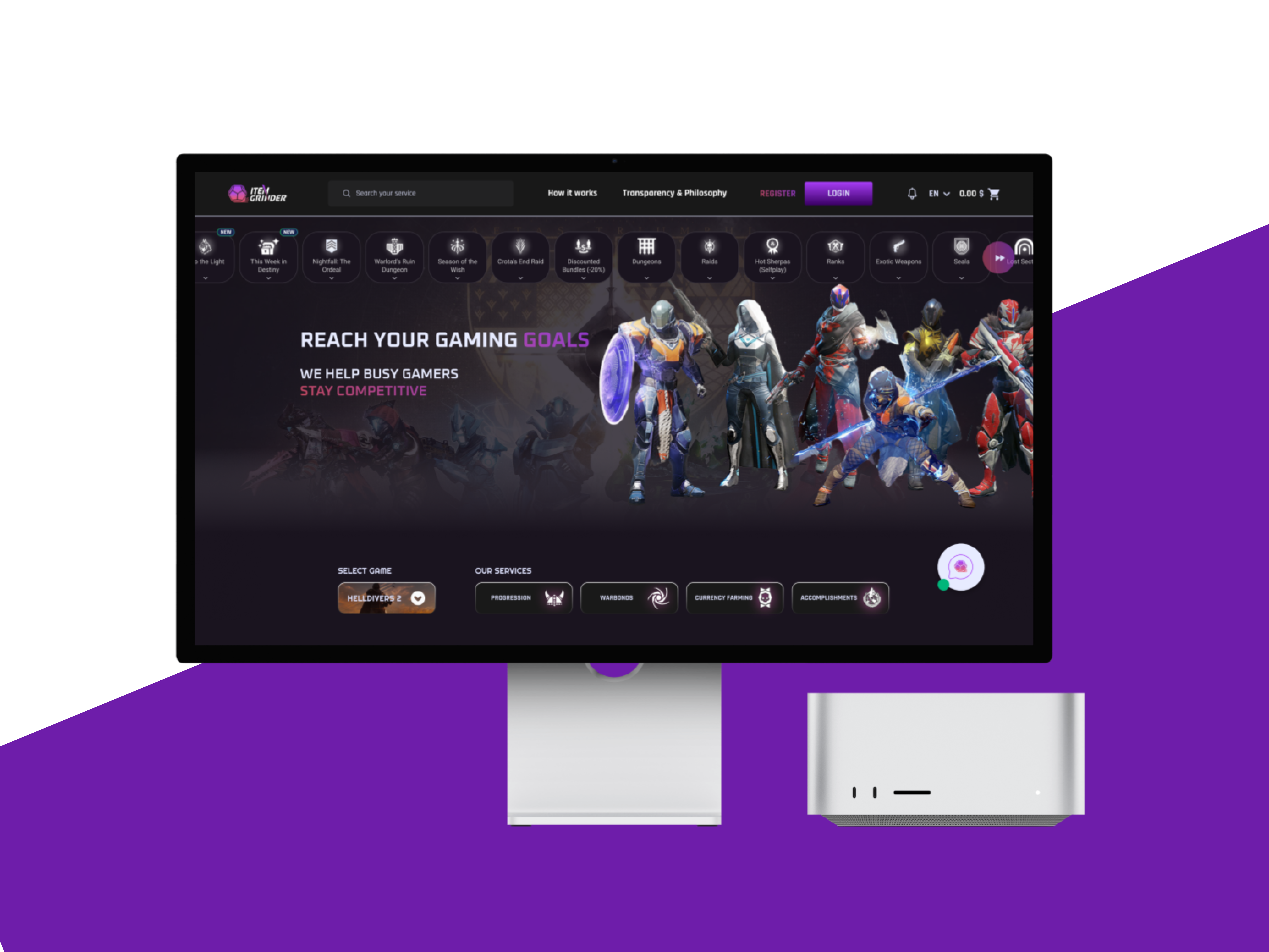
I started by studying major gaming marketplaces and identifying what made them engaging — bold visuals, strong categorization, and a sense of community. Based on that, I structured Item Grinder around three priorities: clear navigation between games, smooth checkout flow, and an aesthetic that instantly appeals to gamers.
A key struggle early in the process was balancing the visual richness of gaming design with usability. The client wanted heavy use of graphics and neon elements, which initially made the interface look cluttered and hard to read. After several iterations, I refined the design system with a darker base palette, selective color highlights, and improved typography contrast to make content pop without overwhelming users.
Another challenge was designing the asset preview pages. Each game had different item types, price models, and rarity levels. I created a flexible card system that could adapt visually while keeping consistency in layout and interaction.
During testing, users appreciated the visual appeal but wanted a faster way to filter items. I added quick filters and hover previews that reduced browsing time significantly.

The final design delivered a bold, modern gaming atmosphere with smooth transitions, responsive layouts, and clear CTAs. The client was highly satisfied with the balance of style and usability, noting stronger user engagement during early testing


